Back to that question that keeps me up at night: what does a conversation look like?
And why is that important?
In the 1860s the typesetter Édouard-Léon Scott de Martinville was developing a machine that recreated voice into a visible recording. He called these diagrams of speech phonautograms, and they were beautiful, shadowy images reminiscent of charcoal drawings. For a few more early visual recordings of sound, before Thomas Edison, see this post, or Patrick Feaster’s investigations into historical media.

image from https://www.buzzfeed.com/perpetua/7-sound-recordings-made-before-thomas-edison
Music, both instrumental and vocal, has been made into visual diagrams for centuries. We’re familiar with the current five-line staff system, yet how many (non-music majors) know about the cheironomic notation for chant? Its a system of words combined with accents that indicate the rise and fall of melody. You can see the motion of the conductor’s hand in these gestural marks:
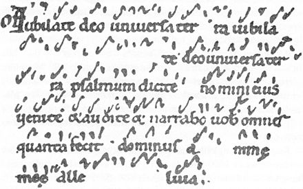
image from https://en.wikipedia.org/wiki/Neume
More recently, John Cage and others in the 20th century explored a variety of loosely defined graphic scores that gave instructions for performing music. Much like Sol LeWitt’s wall drawings, the instructions stress concepts, rather than the product, and challenge the idea of a singular vision of a work of art. In the same way, these visual representations of music allow the performers to create a complex and unique experience.
John Cage, 4' 33", 1952. from http://www.bbc.co.uk/blogs/radio3/2011/11/433-words-about-john-cages-433-and-the-first-ever-radio-realisation.shtml

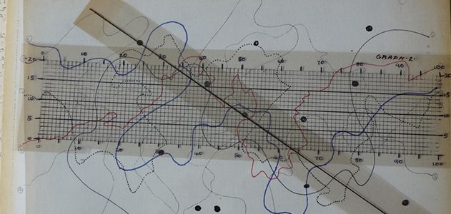
in 1970 graphic designer Ranier Wehinger created this visual of Ligeti’s ‘Artikulation’ 1956 score, listen to the electronic sound here: http://www.erase.net/video/?v=43

Brian Eno, Music for Airports, 1970. Image from: http://www.archipanic.com/electronic-music/03-brian-eno-music-for-airports/
These ideas are bouncing around in my head, much like these graphic scores, and I circle back to “Why?”
These stories and reminiscences are important to me; they form a part of my identity, where I’m from.
In this time of intense, inflammatory, and superficial bits of information, the preciousness of an in-depth conversation—both listening and speaking—is made more apparent by combining linguistic signs in an alternative visual format than standard sentences.
We are becoming more and more accustomed to reading text as a finite commentary. The art of listening, thinking and responding is evidence of being present with others.
This is the reason and relevance for this work.